Friday, November 21, 2008

Design Communication

Floorplan, check. Sections, check. Elevations, check. Sound familiar? I've always wondered why professors made these requirements for projects, at least in the traditional format of construction drawings. Do professors really investigate every line of every drawing for every student in the class? Probably not. I question their necessity in our education where it seems to me that the most important part of any studio project is the [process involved and the ideas being presented].  I guess what I'm saying is we as students don't question traditional practices and what we have to gain in our education from doing these types of drawings enough.

You don't need a 5 year professional degree to do CAD drawings (I got a job pretty easily with an associates degree). Honestly, I don't even think you need a high school diploma as long as you know how to use CAD, since most new employees learn on the job anyway. You would be cheaper to hire and I'm sure they [architects and engineers] prefer that.

I'm not saying this skill is unimportant. Its very important, its our way of communicating how something gets built but for design education  is it ultimately necessary to have students spend time checking off these requirements? Are they learning about new ways of thinking or becoming more creative by doing these drawings? 

Most importantly, are they the best way of communicating a designer's ideas to an audience of people?

A perfect example that comes to mind is what is currently happening with the second year studio I assist in teaching with. They only see requirements on a piece of paper for scaled drawings, models, etc. They wonder why we can't see their conceptual ideas and I say it is because of the limitations of the medium they think they have to work in. 

How is it that so many of us have turned a blind eye to the arts and other avenues of conveying information? These areas have so much influence to offer on our process work and presentations.

I read a lot about Cubism last year in Stoel's furniture studio. Picasso and Duchamp were making paintings about how paintings work. They were showing what the mind knows rather than what the eye sees. Since I am a cubist fan its not a surprise that I am also a huge fan of Zaha Hadid's work. Her paintings and ways of conveying architecture, not only as eye candy, but as true conceptual ideas and physical concepts [her models are just as spectacular] are a breath of fresh air. She is only one but I'm sure there are many that push and pull in different ways to get their ideas across to the masses.

In time I hope to develop my own signature style and poor attempts at recreating someone else's will do for now as a learning experience. I suppose it helps to know there is a place for that in the world.

(The first two images are my own but the other three are Zaha Hadid's)

Wednesday, November 19, 2008

Have you ever been branded?

After having messed around with the pixels I've been thinking of a way to abbreviate Corolla Borealis [not permanently] for design purposes [signs, labels, bags, posters, etc]. The brand will eventually speak the same language as the store with references to the material change in the solid/translucent relationship combinations. This is just something for you to chew on for now.


What goes on a ceiling besides paint....

Addressing the lighting and landscape of the ceiling actually turned out to be an extension of the manipulations of the pixels. Some were better suited for structural members (beams and columns) while others appeared to fit the light fixture category. There are even cases where the beams and columns have lights built into them (ha, like everything else in this project). The lighting fixtures were designed and placed in response to what is happening on the floor below them [game terminals, displays, etc].
(ceiling starting to breath a little)

(no walls!)

(example fixture section)

Tuesday, November 18, 2008

Beta Section & the pixels of the apocalypse [Building blocks - Kit of Parts - Retail it Yourself!]

The first one on the right is the guy that started it all (not the guy, the form). If you've been following along, you'll remember how I manipulated that form to fit within uses in a diagrammatical 3-D model. Within the past few days I split the original into parts and changed the parts into their own basic "pixel" form. As previously mentioned and shown, the parts have been used to create walls, fixtures, floors, structural elements, and soon to be ceiling elements. The idea I'm leaning towards is that each particular area will carry a different combination of visually solid [concrete, plastic, metal] and translucent [plastic, glass] materials. The surfaces all seem to have a perceived texture in that their appears to be level change on the varying planes when in fact (in some cases, not all) the change is only visual. Where a visually solid material ends and appears to drop off, a translucent material begins. Stay tuned, more to come today...

Weird...

On a break from studio work I was looking at a blog tonight and I came across a post referring to theoretical architecture shipping container communities. The story and futuristic aspect of that kind of environment (hell even the images) are almost an exact replica of the minimum project I did as a 2nd year student under Patrick and Robert. 

Similar images.

Great minds think alike?

Its not the future I would prefer but who knows where we'll end up....

Monday, November 17, 2008

Mystery Science Theater 3000 Machine


MST3000M  just keeps popping things out like a factory. Right now I don't think there is any limit to the number of fixtures I can come up with having made 5 main base "pixels" to manipulate and work from. These have not only translated into display fixtures for consoles and games but have also translated into the cash wrap (sp?) shown in perspective, divisional partitioning constructs (or walls), the floor, the ceiling, the shell, seating, and gaming terminals. The pixels are a constructive combination of various types of recycled glass, bio-degradable plastics (both translucent and non-translucent), and steel. How all of them will be built individually is perhaps beyond the scope of the project (and my own abilities) but a detailed construction & material example will be in order to help people understand how everything generally goes together.


Example Presentation Slides

After meeting with Suzanne for a brief moment and speaking a bit about the name of the store I don't feel so weird about it anymore. After explaining where I got the name from I realized, with a little encouragement, that the name is yet another part of this project born from my process and examination, which can come off as a little strange (and highly confusing) to most people. The disadvantage to having such a perplexing style (?) is that people might not follow the path I've laid out for them visually and audibly initially, with regards to a presentation. It is my hope that people see things that excite them in my project (and not just this one particular) and in combination with the above mentioned confusion, they feel more encouraged to have a dialog  or ask investigative questions about my design decisions. I think this presentation strategy works well for me because I am just as excited to talk about my ideas and to talk with people about what they think I'm thinking. Hell, if you can't talk about the most important parts of your project at length you should ask yourself what you've been doing the past 4-5 weeks.


Saturday, November 15, 2008

"Do you expect me to talk?" "No Mr. Bond, I expect you to die."

(conceptual plan)

Just wanted to throw that quote in because we [Kaylin, brother and his girlfriend] went and saw the new James Bond movie, Quantum of Solace. And because I enjoyed the movie (Daniel Craig plays a better Bond then Brosnan. He should have stopped with Goldeneye) so much I've decided to name the fixture that is potentially breathing new life into my project after the movie. I present the 3 scales of the "Quantum of Solace Display System 3000." I was originally going to name it the "Mystery Science Theater 3000 Display" but not many folks these days know about that show.

(3 scales)

(two investors)
"Yeah this place is pretty awesome. We should invest in the company and hire this Jimmy guy to do design work for us."
"Yeah, I agree. I actually don't know if I'm experiencing visual ecstasy or this is my brain telling me I'm about to have a seizure...oh, watch out for that pitfall."

(conceptual perspective)

After today's adventures I've been thinking about constructing my store in a different way. As you can see I've got a [building block, pixel, etc] and I have manipulated the scale of the pixel to fit the varying parts of my 3 dimensional diagrammatical usage model. The plans and perspectives shown are the outcome and again I feel rather [pleased & surprised] my process keeps taking me to places that I hadn't thought of before, mainly the idea behind taking this one unit/fixture and stretching/contracting its volume in a way that starts dialog with the varying areas within the store's volume. I feel I've finally started to tie my physical models into the 3 dimensional model of the store and how everything fits together.

Conceptually, I'm still with "the refracted pixel" which is what I've deemed a [designed]  concept. 

[The Refracted Pixel]
"A point of information that changed passing through a medium."

Pixel: [essentially any building block described by the criteria below, not limited to one type]
Descriptive Information Category: [direction, form, texture, color, light, material]
Medium Category: [floor, ceiling, wall, special area]

Considering the 3 major areas [service, entertainment, circulation] perhaps they each are made up of their own type of "pixel." I think this fits well with the change through the different mediums.

Friday, November 14, 2008

Tuesday, November 11, 2008

Corolla Borealis?

(important diagrams!)
I think the name is a bit of a stretch on relating to a concept but light is what got me thinking of it in the first place so consider this a bit of a shout out. I'm sure you noticed the northern lights reference but "corolla" refers to the collective petals of a flower. Petals fall into the category of a type of pixel and their repetitive nature helps the decision. I didn't want to use aurora but I wanted to keep the way it in which the phrase rolled of a person's tongue. I'm at a loss for words and honestly it just sounded good but potentially lame the more I think of or say it. It can change and it probably will but for now I've got other things to work on.

Working Model Status


The steel rods have added another dimension to the working model. With this additional option the pieces are no longer limited to connecting at such a close proximity with each other. With varying rod lengths and insert placements I've even started to manipulate the directions in which the pieces can connect by slightly turning/twisting them. On to the perspectives...more to come.

Monday, November 10, 2008

Design in Section

Design in section. A wonderful rule to go by from 101 Things I in Architecture School. With a preliminary understanding that there would be multiple split level areas with different materials, lighting, color, and architectural forms, I sketched out a section. There is no hierarchy and I think its even possible for someone to have a seizure if they stared at it long enough. Instead of perspectives, I plan on doing section perspectives (Edgar!). I've become fascinated with the cut through the store as this will be an excellent way to convey my conceptual ideas and to help me design. Enjoy the fire works....

Sunday, November 9, 2008

Saturday's mixed media olympic trials...

These are the results in my attempts to recreate what happened earlier this week. I think, conceptually and process wise, these are highly successful drawings. I'm satisfied with what was produced and I have some new tricks up my sleeve graphically. Unfortunately, the drawings just didn't move me as much as the first one did emotionally. Looking at the new drawings they seem more complicated and erratic in comparison to the first one. The original had spatial qualities that are not represented here. I should have known this would happen, I was trying to cram everything I could into one piece of paper. I don't know why I did that...hm. Regardless, between these, my on going model study, precedents and store studies I've got a titanic's worth of information, both programmatic and conceptual, to start translating these ideas into spatial relationships in the volume of the store.


Should have posted this a few weeks ago

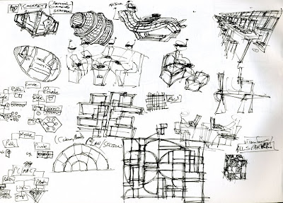
These sketches were my initial thoughts on some of the ways in which people would interact with the gaming terminals [single person, group, public, private, etc] and what that experience might look like. As of late, cubism has also been a reoccurring idea brought to my attention by some of the work I've done so far. I'd like my plans and sections to be first and foremost legible, but I am leaning towards a cubist style of portrayal with a touch of Hadid. Sections and plans can be so boring. Why not make them works of art at the same time? I also did some experimenting yesterday with mixed media [markers, colored pencils, oil pastels, water color, pen ink] in an attempt to replicate the process that was successful in a previous perspective. I've got "it" on paper and whatever "it" is, "it" looks crazy. Now I just need to scan it and see what it looks like after I touch it up in photoshop. That will be on the next post.The sketches were also what got me started on the models I've built so far. I must say its really helped to think about the volume of the store with something that most people would consider a toy (myyyy blocks!). The blocks have grooves on the sides and on the top, holes in the sides and top for steel rods, and today I'm going to start cutting 1/2 planes of plywood at varying lengths to act as connectors between the blocks as well. I think that puts the number of types of connections at a possible 6 (if you use the planes vertically and horizontally). I will probably focus more on the details of the store and less on the model now that I feel I've reached a good point of study.

Friday, November 7, 2008

We have lift off!


So my perspectives were not much to look at (2 two of them anyway). They were more representative of conceptual perspective diagrams which is what I was shooting for. My third perspective haphazardly occurred in the background as a product of my rendering the first two perspectives. The marker bled through the paper into the sheet underneath and after noticing this I quickly (right before our group meeting) began to draw over the random forms that were created as a biproduct of my previous renderings, creating what I like to call a "Zaha Hadid Style" perspective. I scanned the drawings after class and brought them into photoshop for a little touch up. I didn't expect the first two to excite me but the third was a different story. The manipulated image that I saw sent my mind and eyes into ecstasy. I'm quite proud of having found a new way of mixing media and it amazes me that this whole process has coincided with my concept. The change of medium changed the life of the work. Is it bad that I want to frame it?